Copper Creek Dental
Web Design
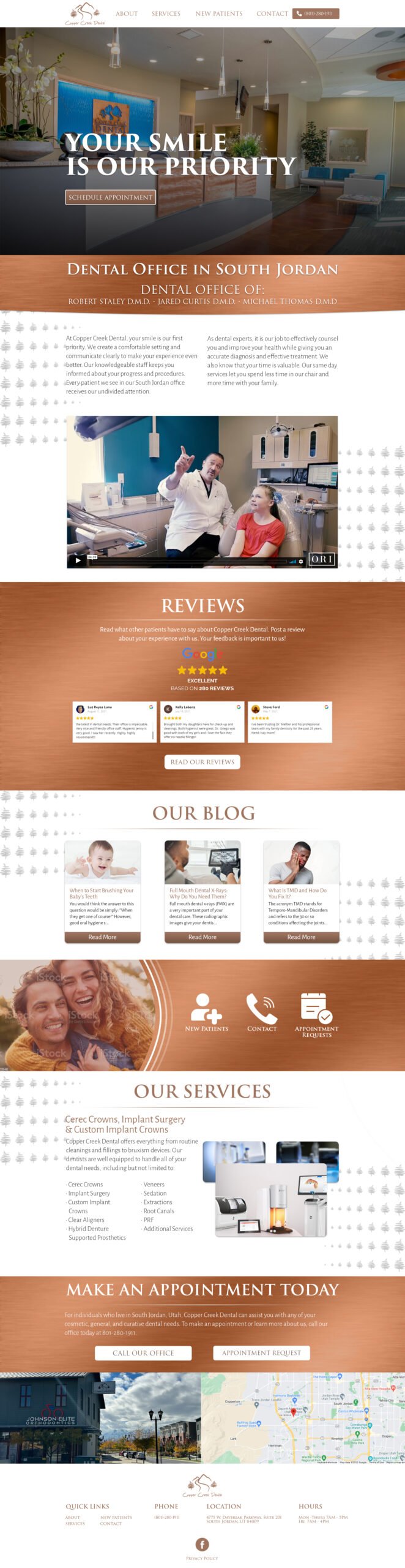
I designed a new website for Copper Creek Dental. They wanted a more modern eye-catching website. The content of the site stayed mostly the same, but the layout was updated to be easier to read and find information.

Design Notes From Client
Wants pops of copper color to show throughout the website. Black or white background, wants information easy to read
- Break up content on the page with rectangles/boxes in shades of gray/ another cool color so that the content doesn’t look bland/boring
- Not a super modern font, but not a strong serif font that is too similar to cursive. Does not want it to be difficult for older patients to read
- Photos: Focus on technology in photos, DO NOT show surgical tools in the photos or boring images of their front door like their competition, also showcase that patients are the primary concern